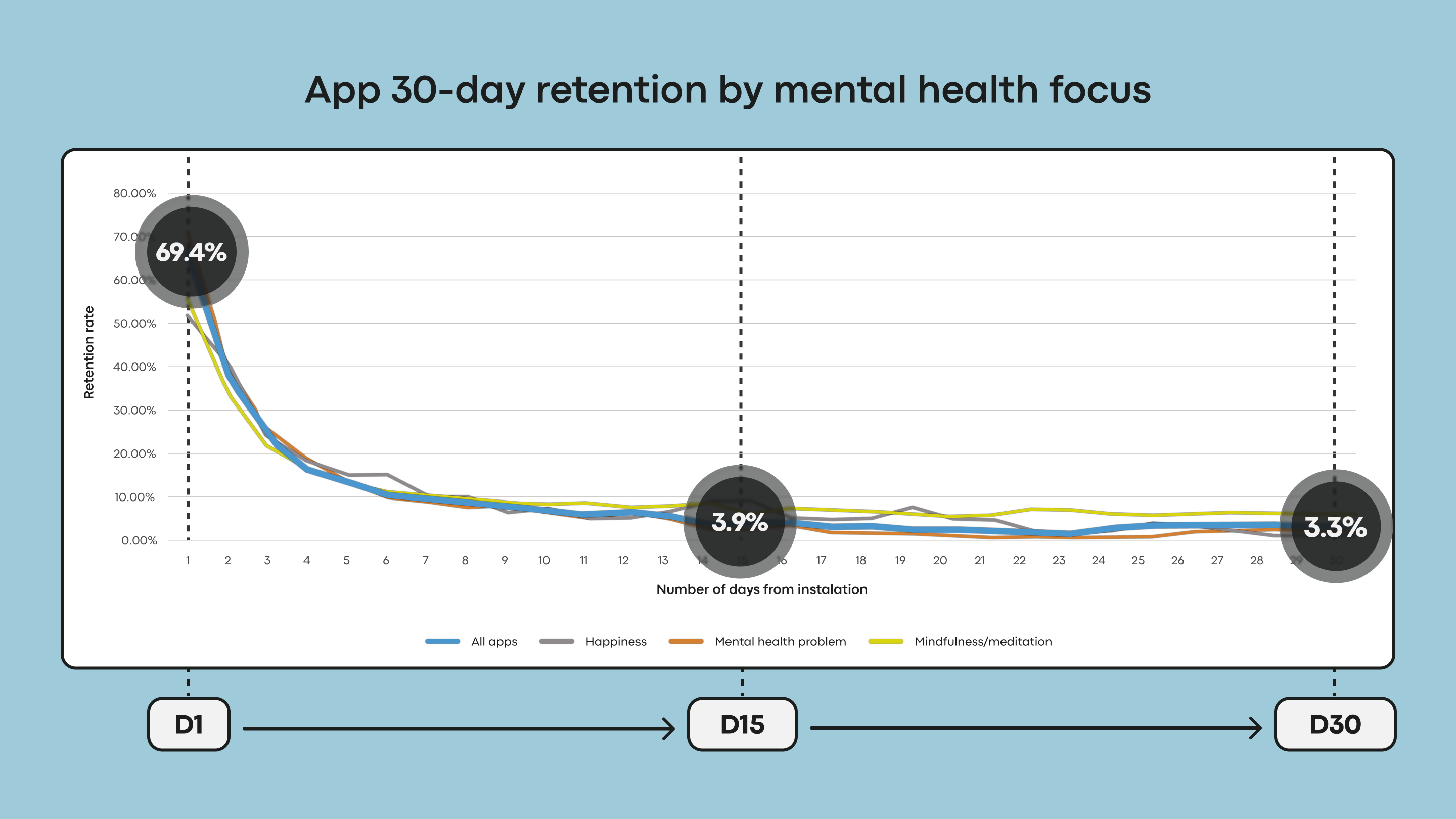
Mental health applications keep facing a continuing, measurable crisis: many people stop using them quickly. The data is stark: almost 95% of users who open the app on day 1 abandon the app by day 30, with a median 30-day retention of only 3.3%. Even the recognised mental health giants lose around 50% of their users within the first ten days. This severe engagement loss and retention collapse are why effective interface design must be a clinical and operational priority. Good design is not merely aesthetic; it is a fundamental tool for user retention.
While many factors drive this abandonment, research suggests that mental health apps have tended to prioritise visual appeal at the expense of what actually sustains users. In a space defined by vulnerability and cognitive strain, chasing visual fashion risks adding effort when users have the least to spare — quietly trading away the utility and trust the app depends on. Users don’t open mental health apps out of curiosity, but from need — often while stressed, anxious, overwhelmed, or exhausted. In these states, an unconventional icon, a confusing gesture, or a flashy animation instead of a delightful surprise becomes an extra cognitive overload. Moreover, it becomes a reason to disengage.
In those moments, visual experimentation from a mild distraction can turn into a friction that undermines the very help the app is meant to deliver. A solution must be a visual interface that is simple in usage and understanding from the first moment.
Crucially, improving engagement depends less on which UI trends you follow than on a single test applied to each one of them: does a trend lower the cost of using the app when the user can least afford it?
The High Cost Of Trend-driven Design In Mental HealthBefore we look into the specific problems, we must recognise a core tension: many
…
Source: Smashing Magazine (Published: Thu, 09 Jul 2026 15:00:00 GMT). Read the full article on the original site.